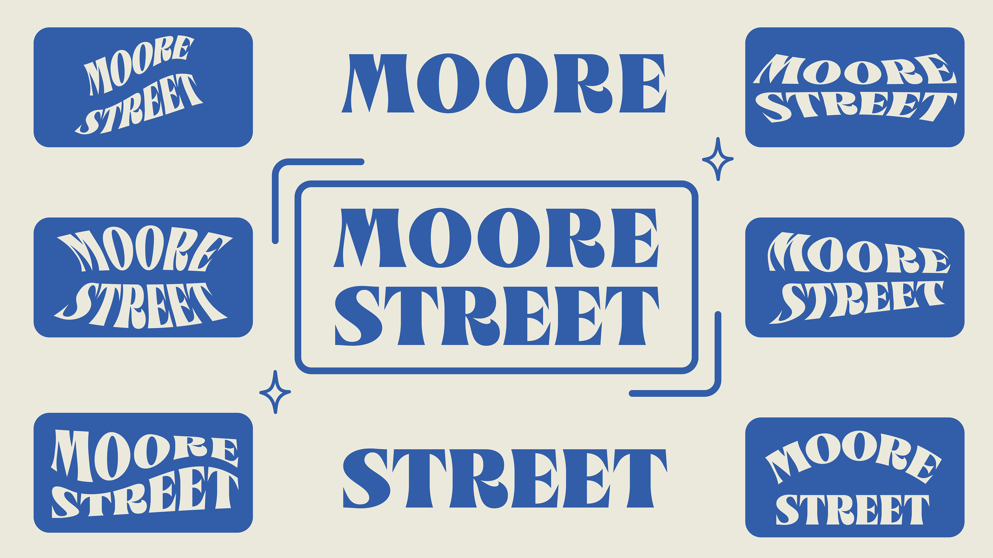
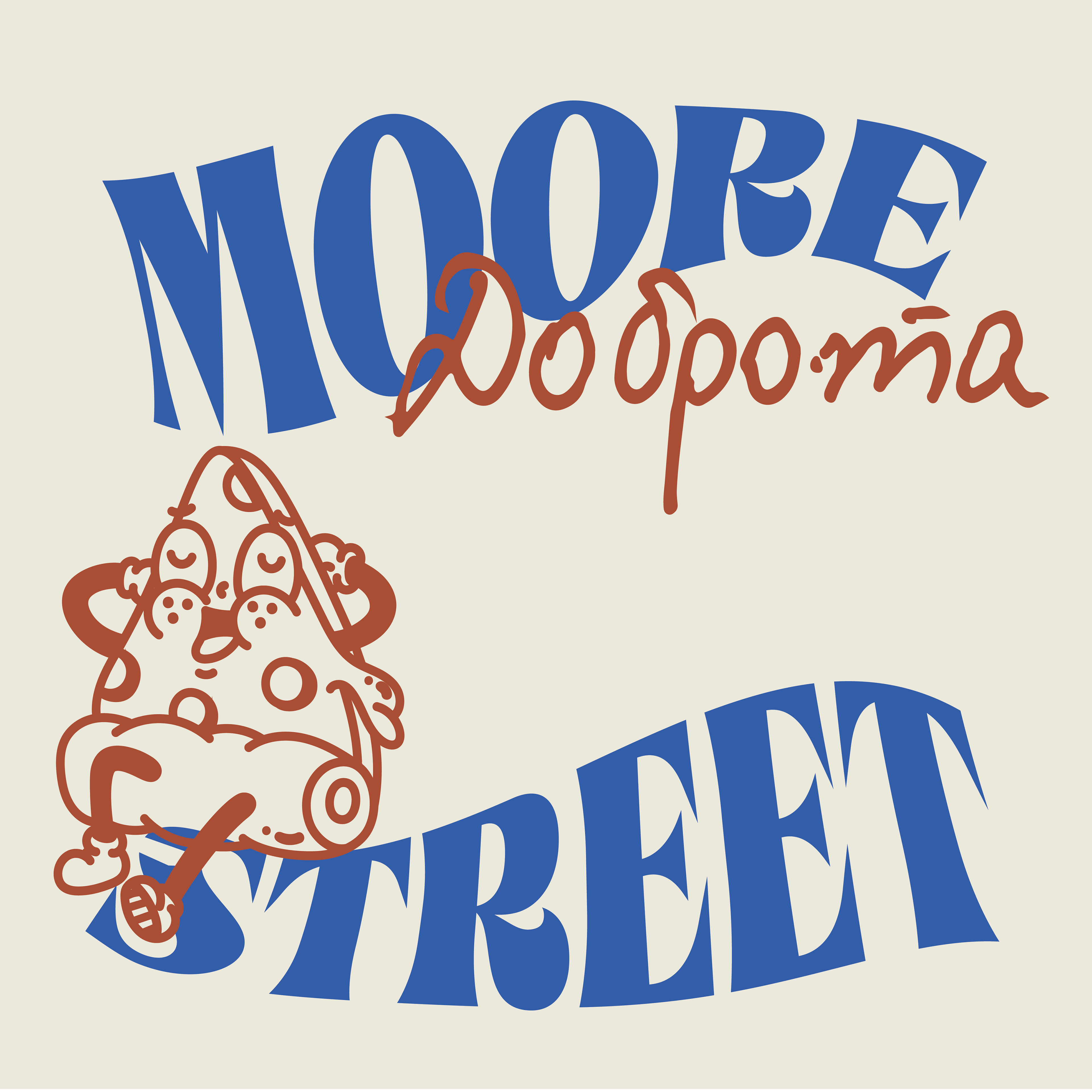
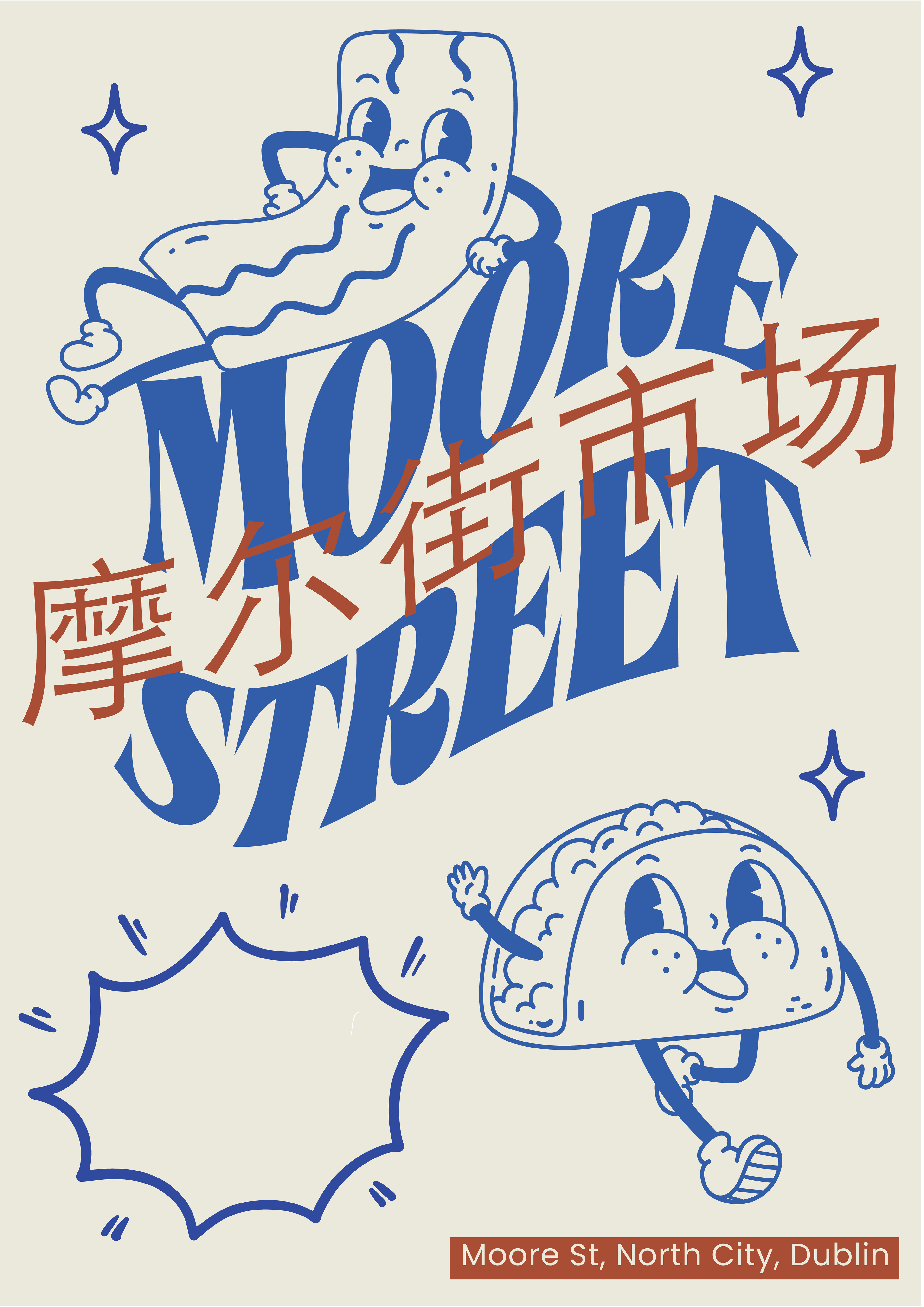
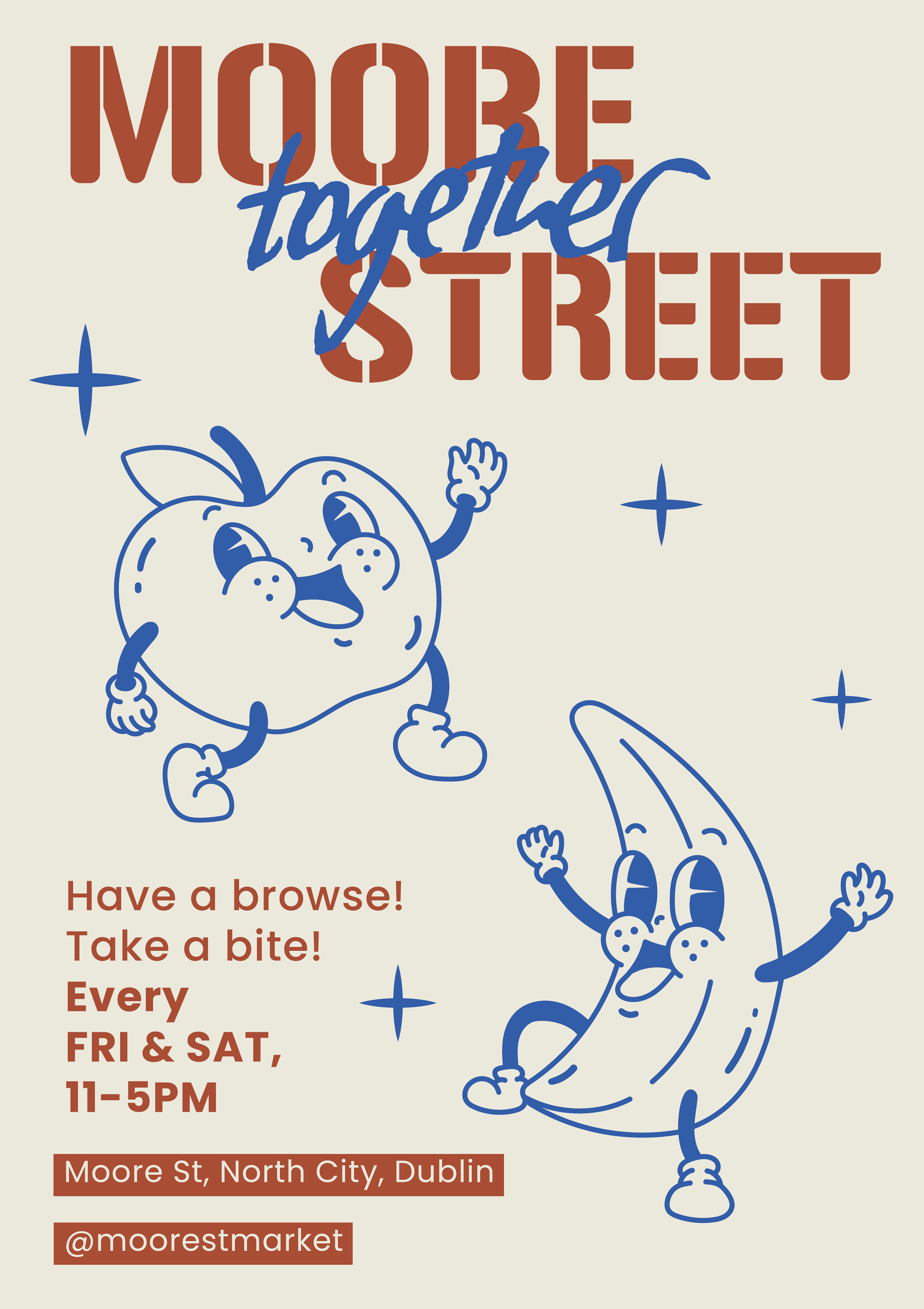
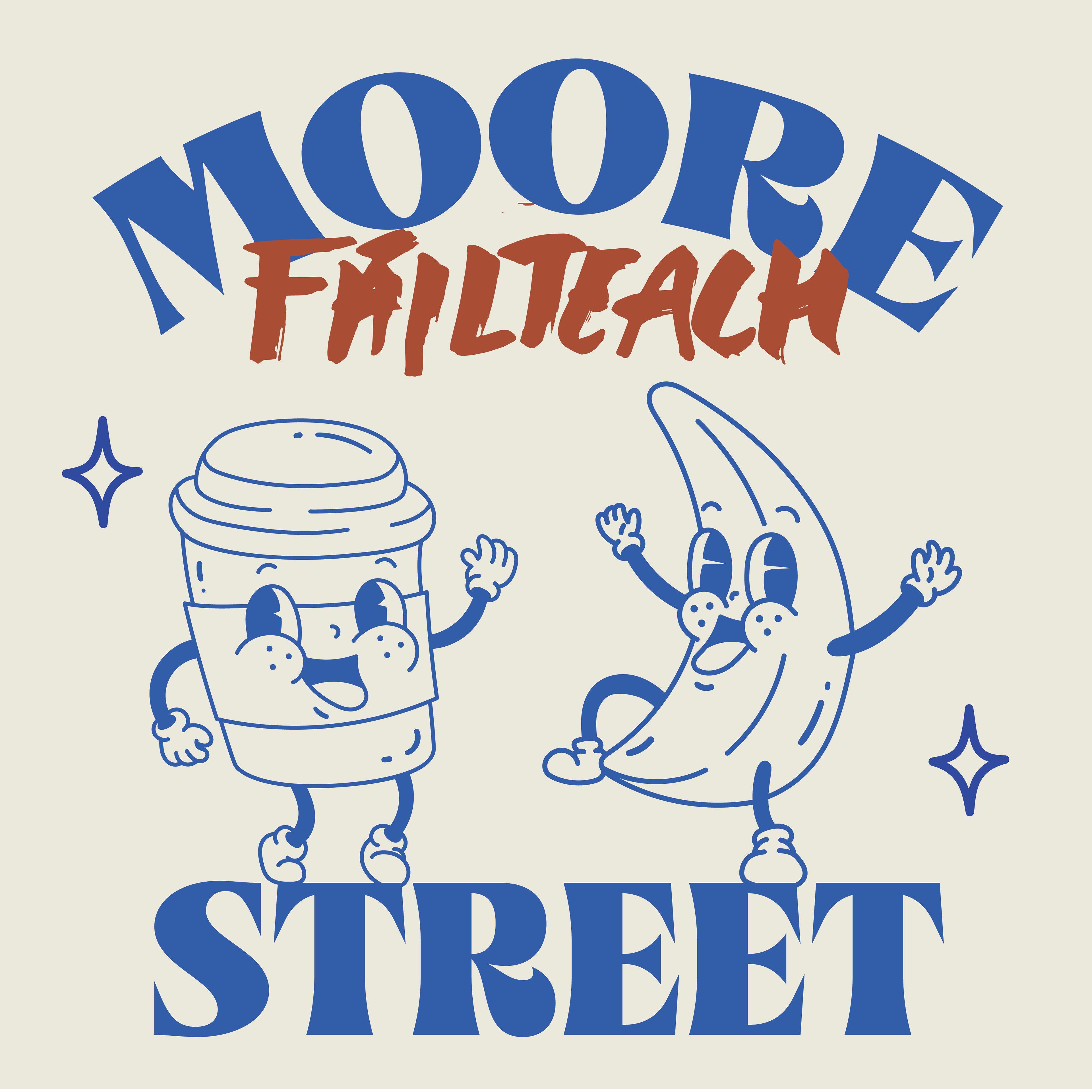
Here are the initial designs for the typographic identity.
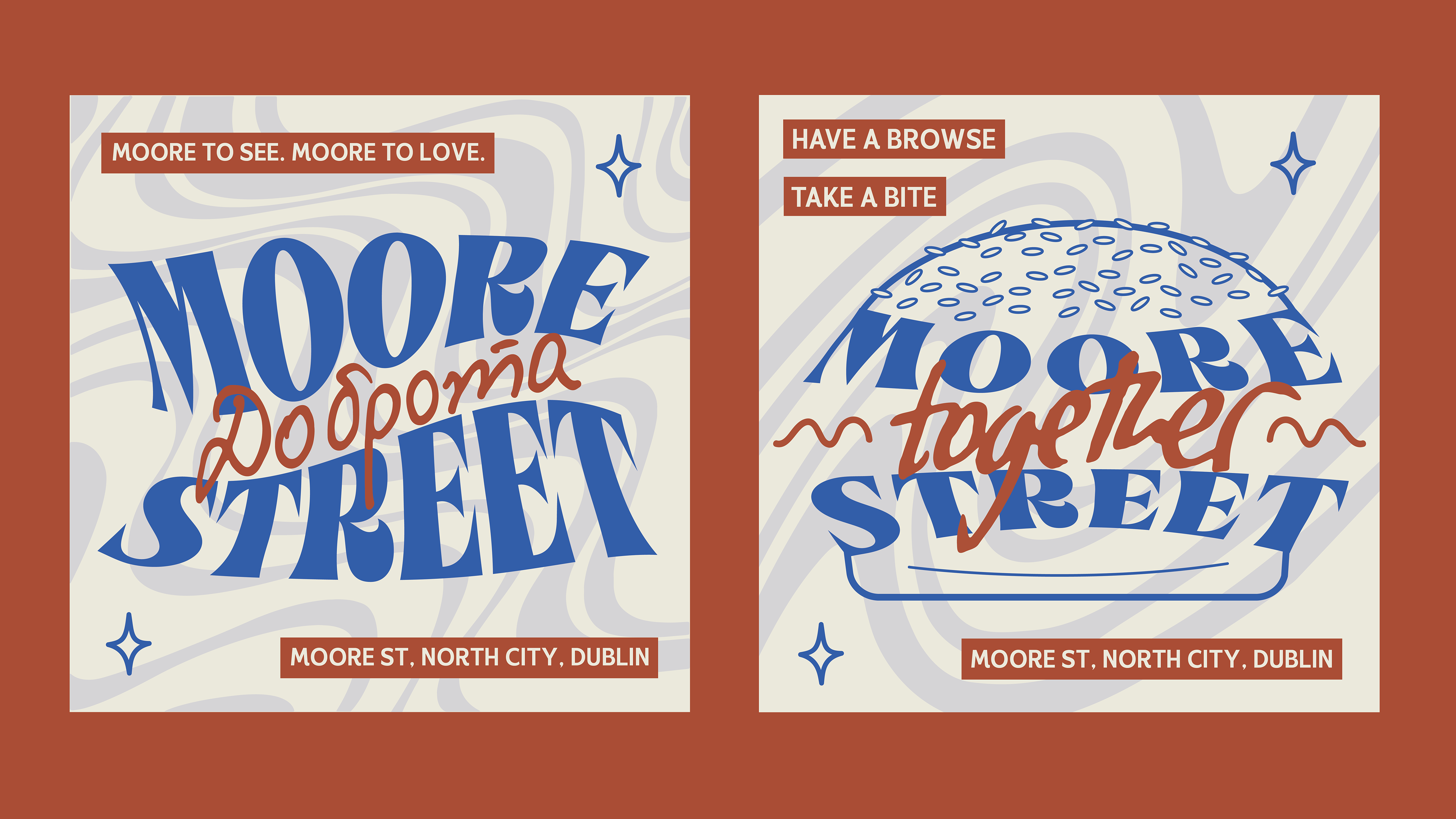
My concept aimed to playfully integrate the street name (Moore) while reflecting inclusivity. The play on "more," combined with handwritten foreign-language words like kindness, welcoming, diverse, etc., imbues the designs with a sense of community and cultural richness. I intended to highlight how Moore Street, rooted in local Irish tradition, has evolved through Moore Street Market into a vibrant fusion of diverse cultures and flavours.
The morphing of text allows for seamless integration across various platforms and designs, echoing the fluidity and openness of the market itself.

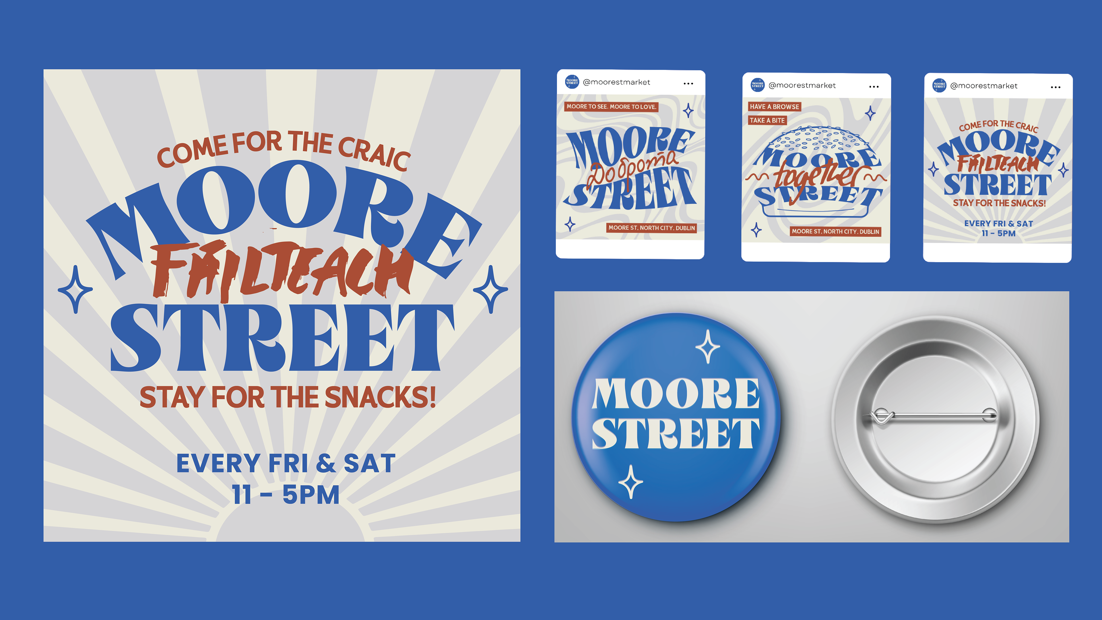
Below are the final designs, along with variations of the how the logo may appear in different settings/mediums.